Context and problem
HashiCorp Vault is the standard for secrets management. However, basic actions require several navigation steps, and system status is not clear at a glance. For a small team, this creates unnecessary cognitive load every day.
The task was to design an interface where system status is clear at a glance, and secret rotation and access provisioning take as few steps as possible.
A B2E product for ANO ICTO. I led product design independently and designed the interface from scratch through development handoff.
Benchmarking
I reviewed the key players: HashiCorp Vault and Infisical. Vault is overloaded; basic actions require several navigation levels. Infisical looks simpler, but rotation and access management are just as complex.
“Everyone installs HashiCorp because it is the right choice, but working with it is difficult — especially when you need to understand system status quickly,” said an engineer on the team.
Takeaway: the problem is the daily cognitive load rather than the available functionality.
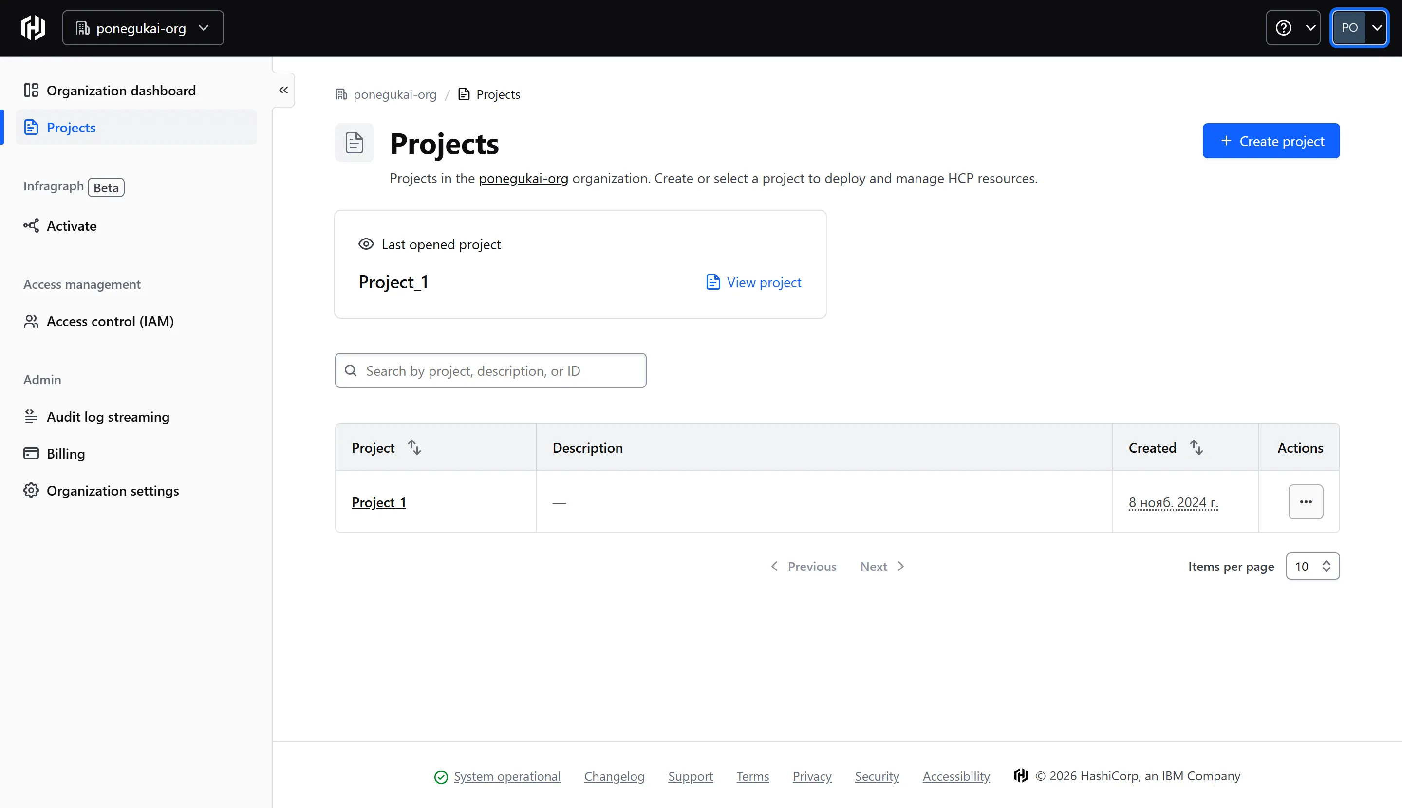
Vault — project list
Projects lack context: only a name and creation date are visible. To understand secret status, users have to open each project. The main screen shows neither the number of secrets nor critical statuses.
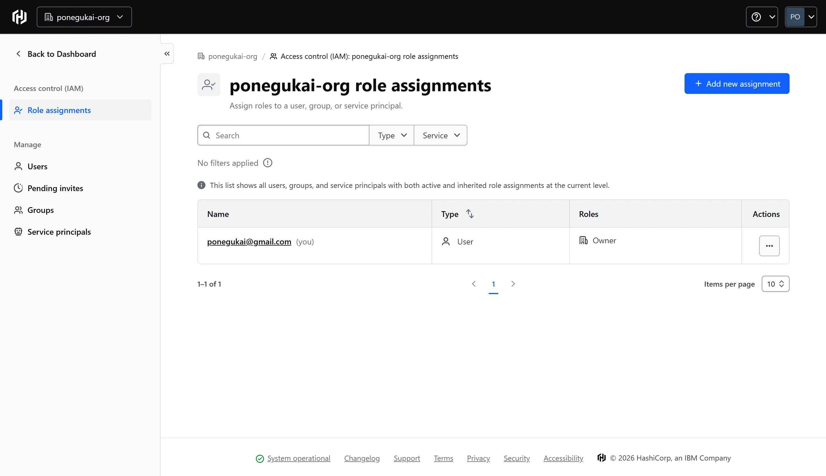
Vault — access management
Roles are in a separate section, disconnected from the project context. Adding or revoking access means moving to another section, finding a user and assigning a role manually. Three actions where one should be enough.
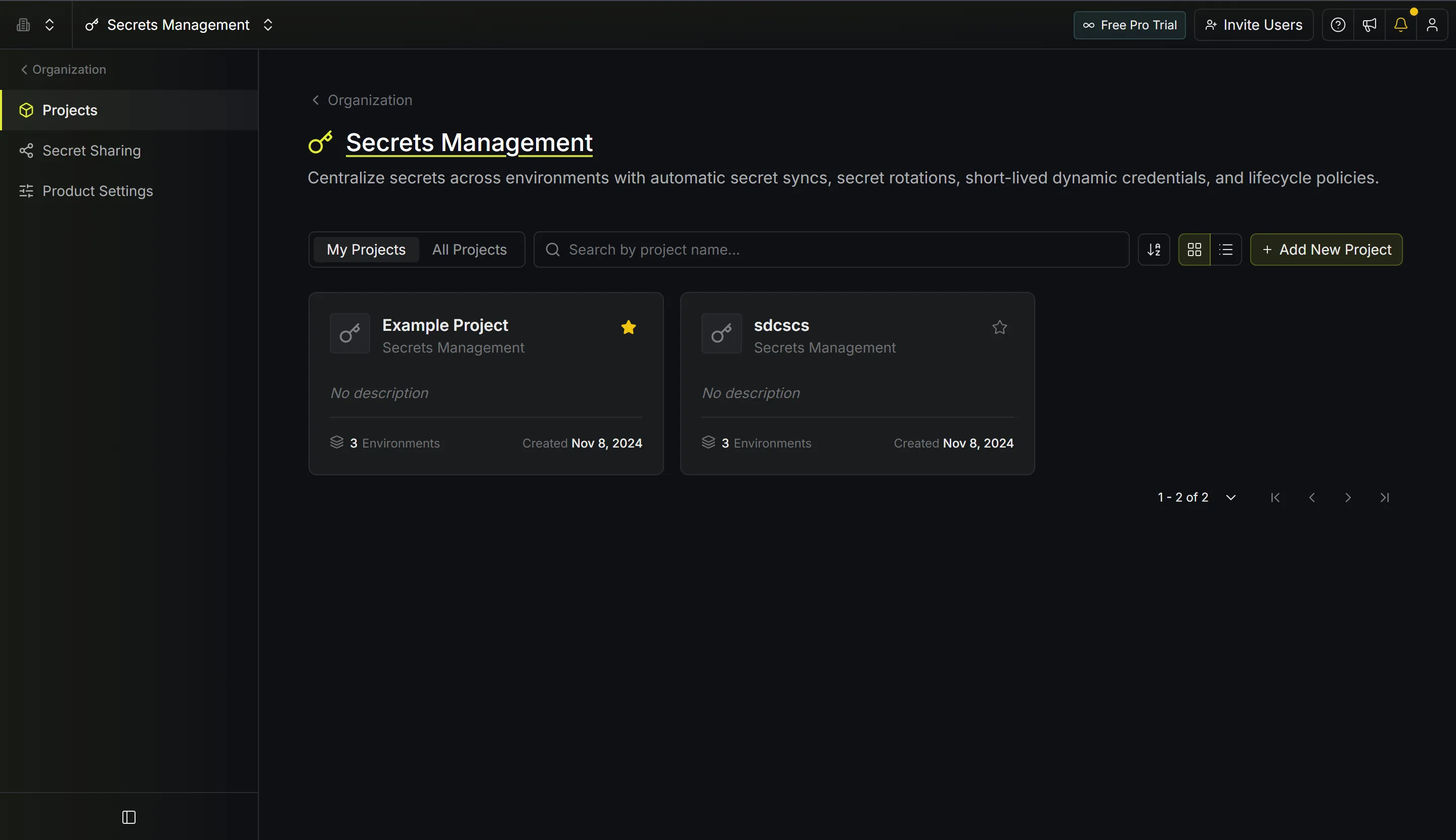
Infisical — project list
Cards show the number of environments, but not secret statuses. There is no indication of what is expiring or needs attention. It looks cleaner than Vault, but has the same problem: system health is several clicks away.
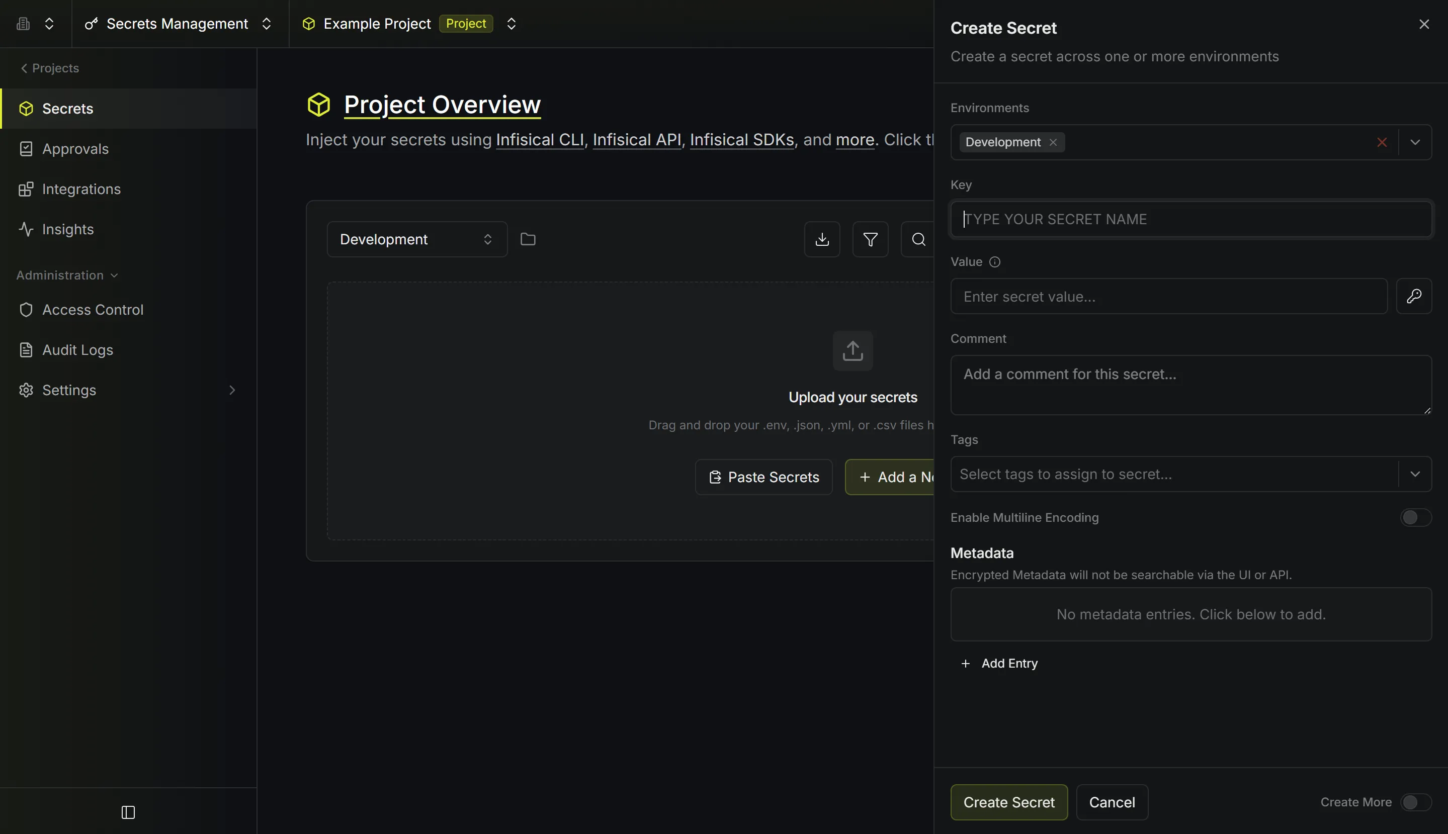
Infisical — create secret form
A side panel with six fields: key, value, comment, tags, metadata and environment. A simple action requires completing a long form, creating more cognitive load than the daily workflow needs.
Hypotheses
Hypothesis 1
The pain point is secret lifetimes, not creation: key rotation and expiration cause the most concern.
Hypothesis 2
Engineers perform extra checks because they do not trust the information shown by the system.
Hypothesis 3
Vault is complex because of its navigation, not because it has too many features.
The three key hypotheses out of four tested are shown above. I examined each in three interviews using real scenarios from the engineers' work.
Metrics
1
screen to understand system status
≤ 3
steps to grant or revoke access
100%
rotation through the UI, without the CLI
15 s
to understand the overall picture
Targets were defined during design; measurements are planned after the pilot.
Interviews and findings
3 interviews with DevOps engineers at ANO ICTO: direct users of the product who work with Vault daily. I built questions around real scenarios. Direct access to the team meant I could use actual cases: an incident caused by an expired key, going on holiday while a critical service needs attention, or granting urgent access at night.
Sample questions
- Think of the last incident involving a secret or access. How did you notice it, and how long did it take to fix?
- You are going on holiday for two weeks, and a critical service's key will expire soon. What will you do before leaving, and how comfortable will you feel going away?
- You urgently need to give a new person access at night. Walk me through the steps, from the request to their first login. Where might you get stuck?
- A newcomer asks, “What is the current state of our secrets?” What will you open to answer, and how many tabs will it take?
- Which secrets tool frustrated you most? What did you do to work around it?
Designs
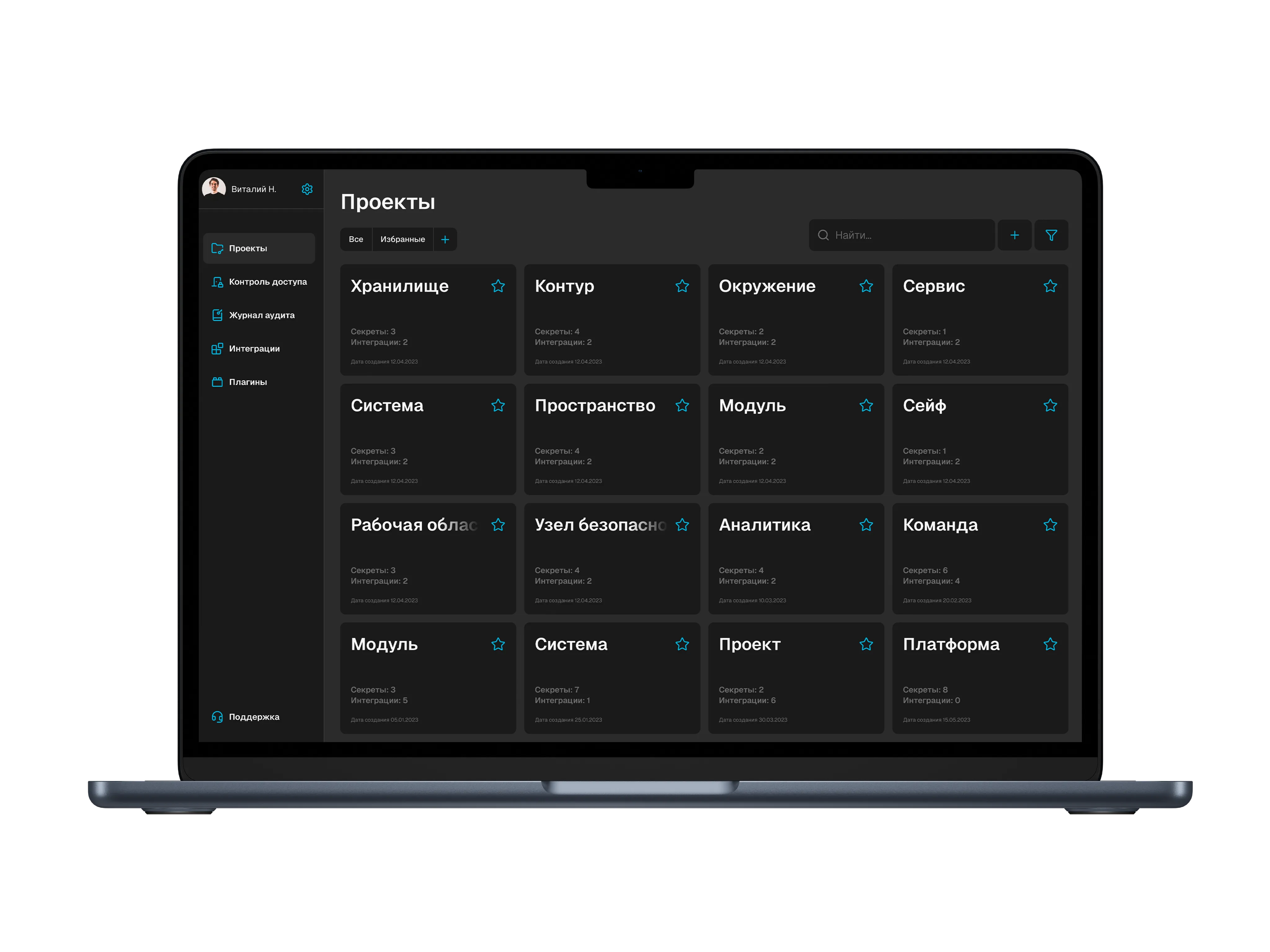
Project overview
One screen shows all projects, their secret counts and critical statuses. Engineers can see what needs attention without extra navigation. This directly addresses an interview finding: “I open four tabs to understand the state of the system.”
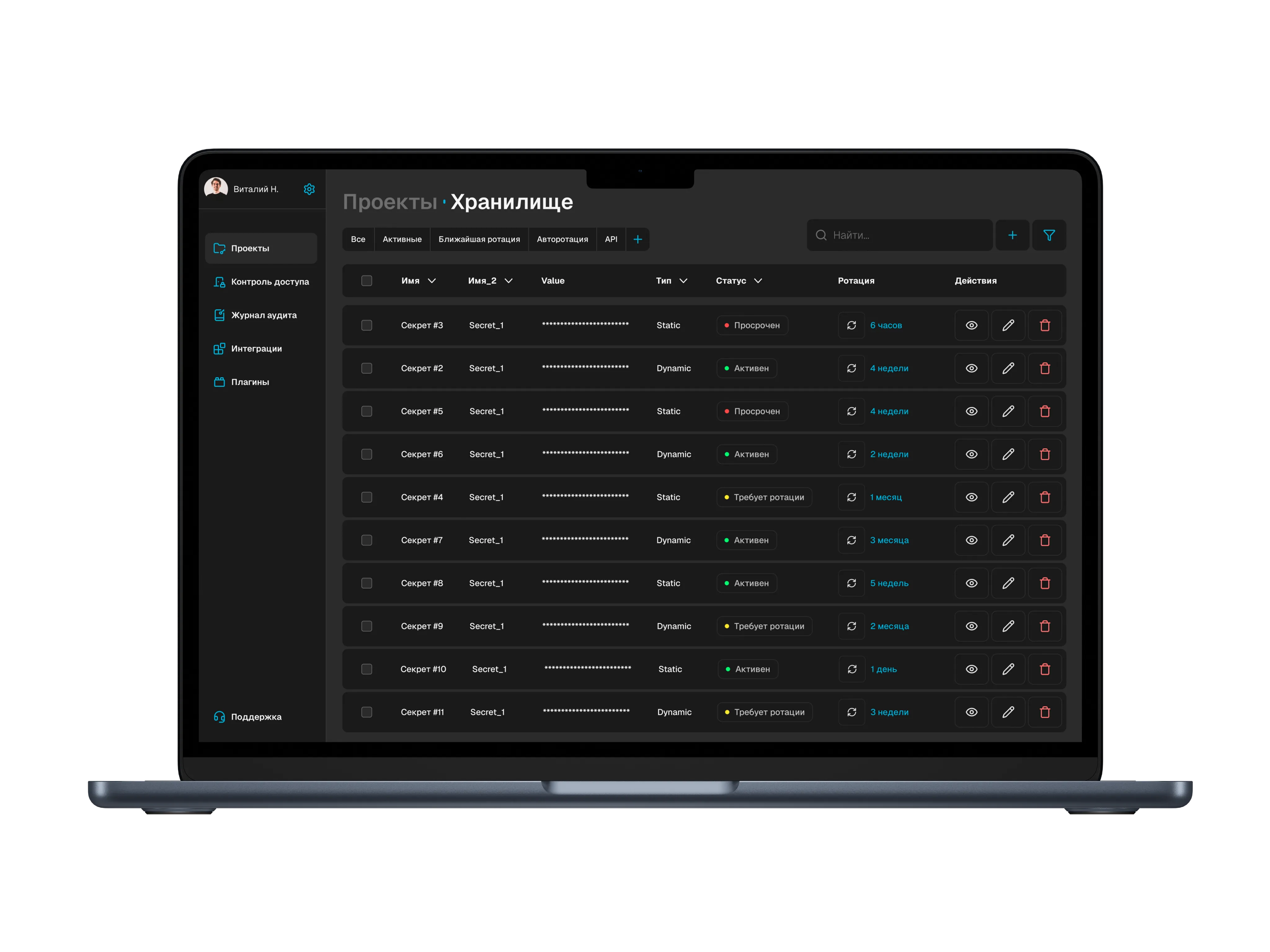
Secrets and statuses
The table shows each secret's status: active, expiring or expired. Sorting by expiration brings critical items to the top. I designed around the hypothesis that DevOps engineers think in states rather than objects.
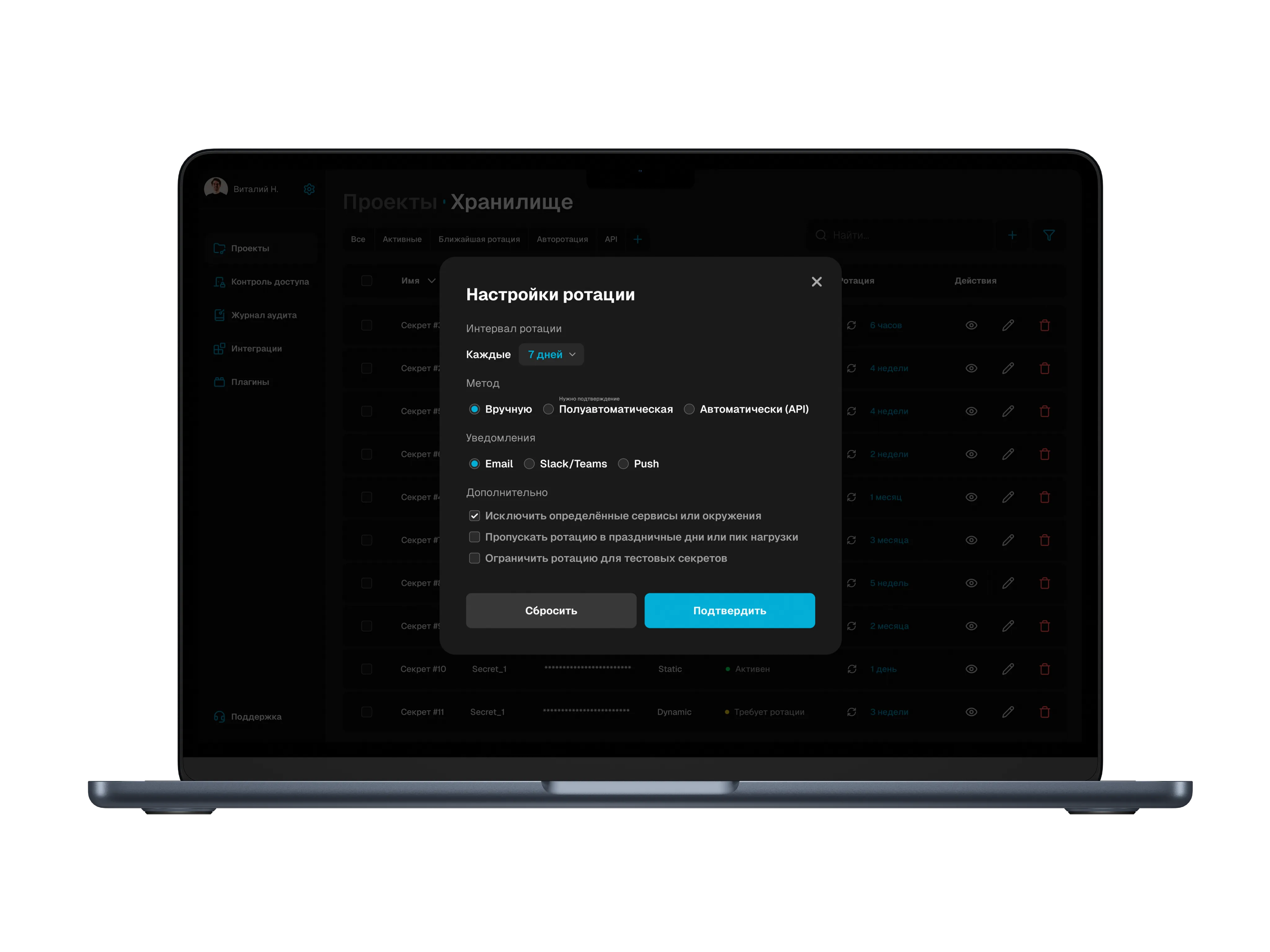
Rotation configuration
The interval, update method and notifications are in one form, without a CLI or YAML configuration. This addresses the most painful research finding: engineers worry about key expiration rather than the mechanics of replacing keys.
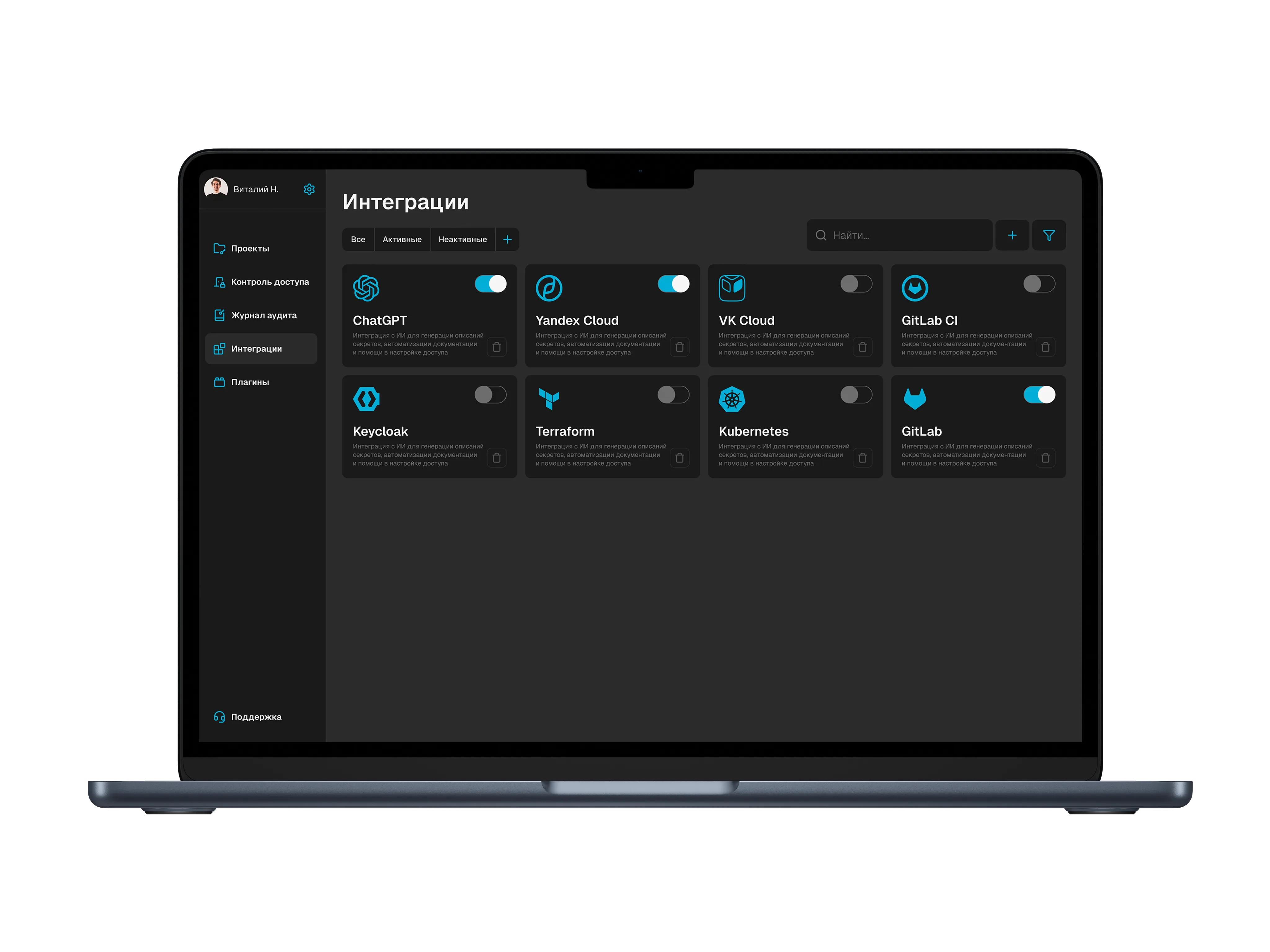
Integrations — an optional screen
I added integrations as an optional module with manual setup. This was deliberate: first establish whether the workflow is needed, then automate it.
Usability testing
Two rounds of prototype testing with the development team and two external DevOps engineers.
Changes made: I clarified roles and added hints because access management was not obvious. I removed an extra access-provisioning step; it now takes one click from the table. I revised the status colors because users interpreted them inconsistently.
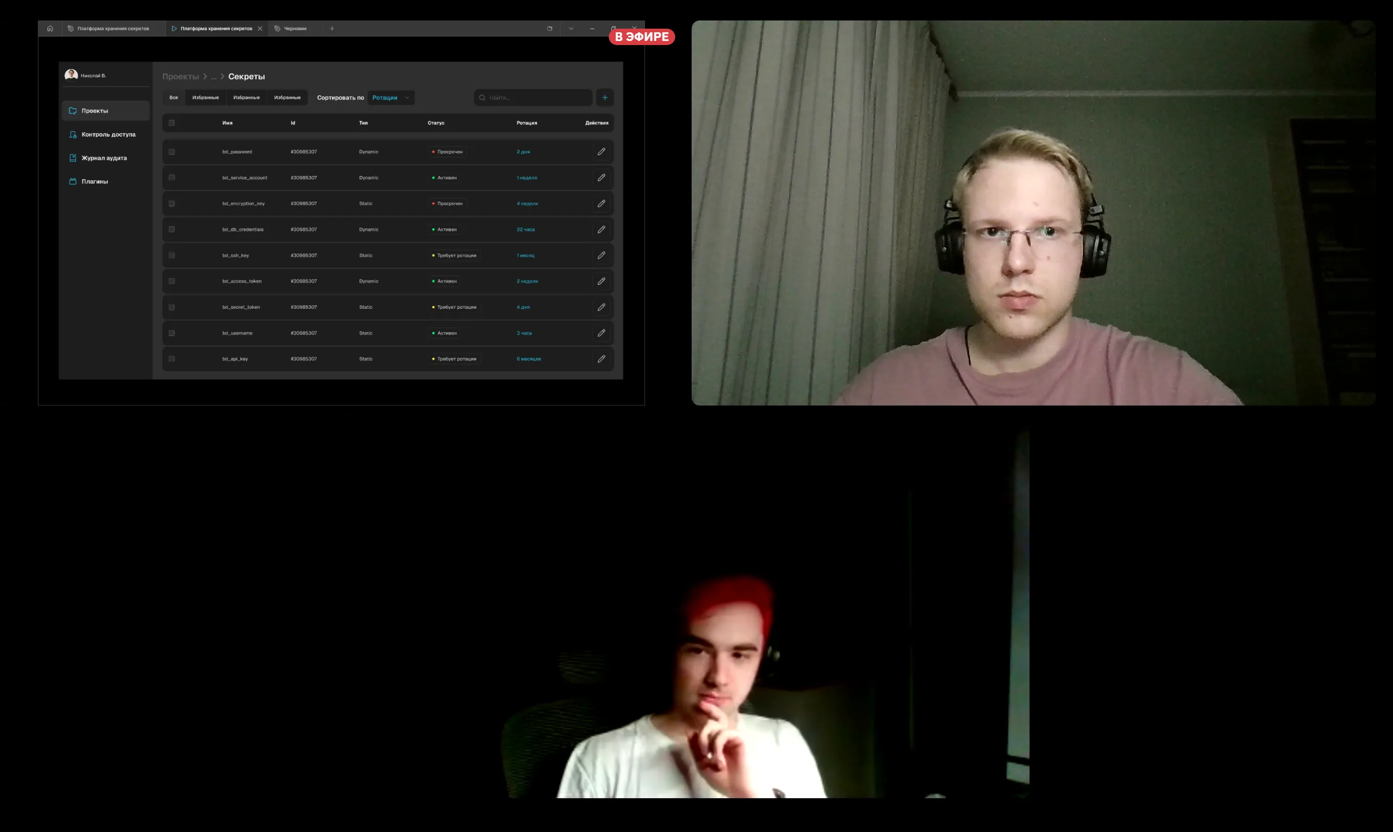
Session 1 — Roma, DevOps engineer
Roma works with Vault daily and agreed to test the prototype. His task was to check whether a particular service's token had expired and give a colleague temporary access. On the secrets screen, he got stuck managing roles: the “Grant access” action was in a context menu that he did not notice. This session led me to move access actions to the table row.
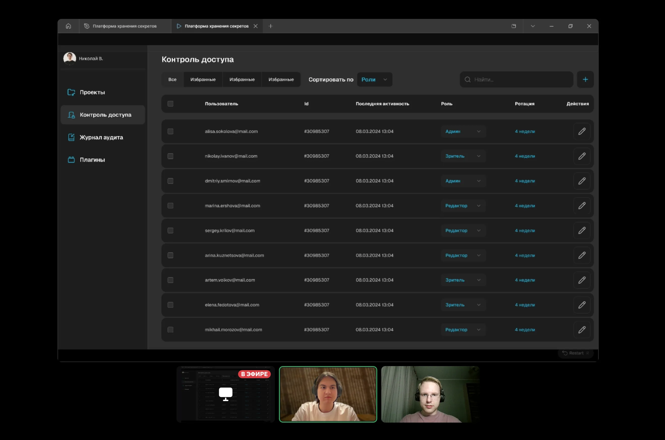
Session 2 — Askar, backend developer
Askar is not a DevOps engineer, but occasionally handles secrets when connecting services to a CI pipeline. The scenario was to revoke a former colleague's access under time pressure. He completed it faster than Roma, but hesitated at the confirmation screen: a modal with two buttons seemed “too serious” for a routine action. I removed that step; revocation now takes one click with a clear status label.
Outcome
I handed the prototype off to development. Following scenario testing, access provisioning went from five navigation steps to one click. Removing the confirmation step also made revocation a one-click action. Secret status can be understood in 10–15 seconds on one screen. Rotation is configured in the interface without the CLI or YAML files.